It’s an unfortunate part of the human condition that we often judge others by how they act on their worst day. Similarly, your customers are more likely to associate your company and brand with that one time you made a mistake, rather than the 99 times you delighted them. It’s not fair, but it’s reality.
If your company does most of its business through a website or app, a customer’s worst experience with your brand may very likely involve an error message. An error message is a critical moment in a customer journey. And yet the content of that message is often given little to no attention.
By creating error messages that are empathetic to the user’s situation, you have the opportunity to make your customer’s worst day a little more pleasant.
Error message content in action
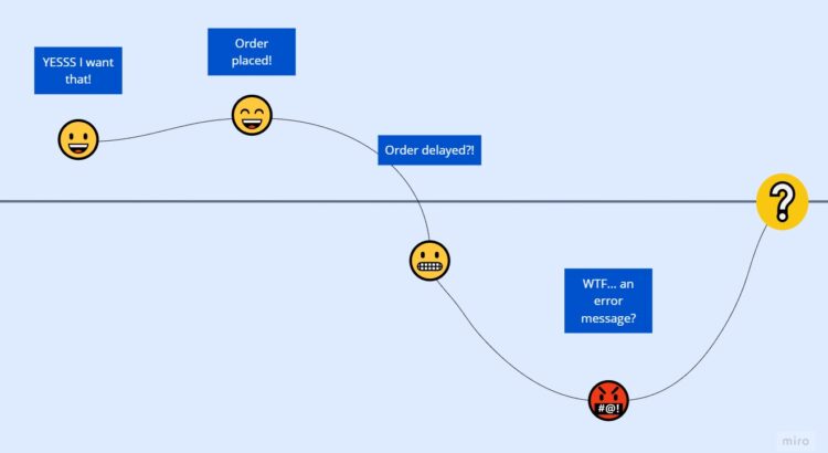
Let’s imagine a scenario: Your significant other has been lusting after a much-anticipated new product from one of their (and your) favorite online retailers. You take the hint and place an order two weeks ahead of your anniversary — plenty of time based on the estimated 5 business days for delivery. A week later, you receive an email from the company letting you know that, due to high demand, your order may be delayed. You’re understandably a bit disappointed and want to know how much longer, exactly, it will take. There’s a link at the bottom of the email offering a place to reach out with questions. Click.
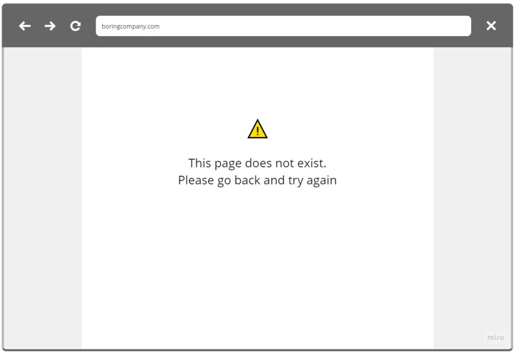
This is obviously not your company’s best moment. Not only did you miss on your initial promise to the customer, now they aren’t able to access the information that may have reassured them things were going to be okay.
Let’s rewind back to that fateful click. Instead of that vague error message, you see the following:
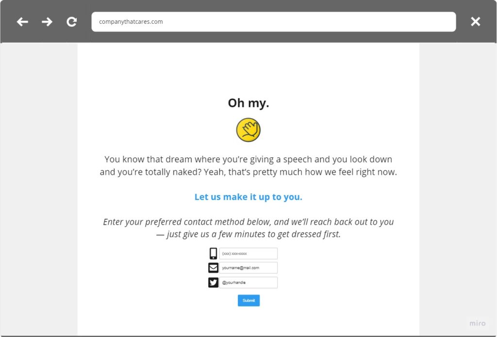
Boom: We just turned an error message into error messaging — a few simple sentences that speak volumes about how your company treats its customers.
The power of good error message content
Here’s what the second option does right:
- Acknowledges the company made a mistake. Rule #1 of user-centered design is empathy. Don’t assume that the user did anything wrong. Whether it’s a bad URL, an authentication error, or an incorrectly entered data field, assume that it is 100% on you, not your customer.
- Places the onus on the company to make it right. Moving beyond whose fault it is, you absolutely cannot expect a frustrated customer to spend more than a few minutes trying to troubleshoot the error. After all, they’re the one paying you.
- Gives the customer some say in what happens next. This is the master stroke. Not only does this content set the expectation that the company will fix the issue, but it gives the user the option to be contacted on their communication channel of choice to see the situation through to resolution.
This exact flavor of personalized customer experience isn’t easy to achieve and it won’t look the same for every company. The important thing is that you care enough to consider this often overlooked moment in a customer’s journey, and seize the opportunity to make it better.
What does your error messaging say about your brand? Set up a consultation today.